
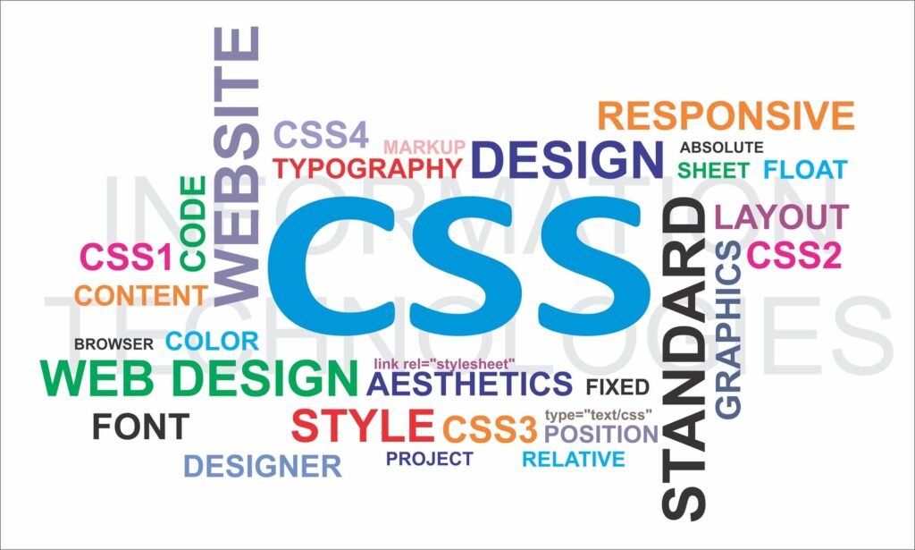
Bạn có biết rằng 100% website hiện đại đều sử dụng CSS và đây chính là “linh hồn” tạo nên vẻ đẹp của mọi trang web mà bạn từng thấy? Từ những website đơn giản đến các ứng dụng web phức tạp như Facebook, Google hay Shopee – tất cả đều không thể tồn tại mà thiếu CSS. Trong khi ngôn ngữ HTML tạo ra cấu trúc xương sống, thì CSS chính là “nghệ sĩ trang điểm” biến những khối văn bản khô khan thành những giao diện đẹp mắt, chuyên nghiệp và thu hút người dùng. Tuy nhiên, nhiều người vẫn chưa thực sự hiểu rõ CSS là gì, cách thức hoạt động và tầm quan trọng của nó trong việc xây dựng trải nghiệm web hiện đại. Đặc biệt với sự phát triển của CSS3, Grid Layout, Flexbox và các công nghệ mới như CSS-in-JS, việc nắm vững CSS không chỉ là nhu cầu của web developer mà còn là kỹ năng cần thiết cho bất kỳ ai muốn tạo ra những sản phẩm web chất lượng. Bài viết này sẽ cung cấp cái nhìn toàn diện về CSS từ cơ bản đến nâng cao, giúp bạn hiểu rõ và ứng dụng hiệu quả ngôn ngữ thiết kế web quan trọng nhất này.
CSS Là Gì? Định Nghĩa Chi Tiết Về Ngôn Ngữ Tạo Giao Diện
CSS (Cascading Style Sheets) là ngôn ngữ tạo kiểu được sử dụng để mô tả cách hiển thị các phần tử HTML trên trang web. CSS kiểm soát bố cục, màu sắc, font chữ, khoảng cách và mọi khía cạnh trực quan của website, cho phép tách biệt hoàn toàn nội dung (HTML) khỏi cách thức trình bày (CSS).
Khái Niệm Cơ Bản Về CSS
Định nghĩa kỹ thuật:
CSS là một ngôn ngữ stylesheet sử dụng các quy tắc (rules) để định nghĩa cách thức hiển thị các phần tử HTML. Mỗi quy tắc CSS bao gồm selector (bộ chọn) và declaration block (khối khai báo) chứa các thuộc tính và giá trị.
Cách thức hoạt động:
- Trình duyệt đọc HTML và CSS
- Phân tích các selector và áp dụng style
- Tính toán layout và vị trí các phần tử
- Render giao diện cuối cùng cho người dùng
Ví dụ CSS cơ bản:
/* Selector và Declaration Block */
h1 {
    color: #2c3e50;           /* Màu chữ */
    font-size: 28px;          /* Kích thước font */
    text-align: center;       /* Căn giữa */
    margin-bottom: 20px;      /* Khoảng cách dưới */
}

/* Class selector */
.highlight {
    background-color: #f39c12;
    padding: 10px;
    border-radius: 5px;
}

/* ID selector */
#header {
    width: 100%;
    height: 80px;
    background: linear-gradient(45deg, #3498db, #2980b9);
}
Đặc Điểm Quan Trọng Của CSS
1. Cascading (Tính chất thác đổ):
- Các style được áp dụng theo thứ tự ưu tiên
- Style sau có thể ghi đè style trước
- Tính toán specificity để xác định style cuối cùng
- Inheritance (kế thừa) từ phần tử cha
2. Separation of Concerns (Tách biệt mối quan tâm):
- HTML chịu trách nhiệm về cấu trúc và nội dung
- CSS chịu trách nhiệm về giao diện và trình bày
- JavaScript chịu trách nhiệm về tương tác và logic
- Dễ dàng bảo trì và cập nhật
3. Responsive Design:
- Media queries cho thiết kế đa thiết bị
- Flexible layouts với Flexbox và Grid
- Relative units (%, em, rem, vw, vh)
- Mobile-first approach
4. Hiệu suất cao:
- File CSS có thể cache bởi trình duyệt
- Giảm bandwidth với CSS minification
- Critical CSS cho tối ưu loading
- CSS preprocessing với Sass, Less
Cú Pháp CSS Chi Tiết
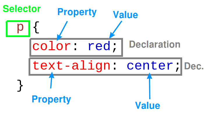
Cấu trúc quy tắc CSS:
selector {
    property: value;
    property: value;
}
Các loại selector:
/* Element selector */
p { color: black; }

/* Class selector */
.container { width: 1200px; }

/* ID selector */
#navigation { background: white; }

/* Attribute selector */
input[type="email"] { border: 1px solid blue; }

/* Pseudo-class selector */
a:hover { color: red; }

/* Pseudo-element selector */
p::first-line { font-weight: bold; }

/* Descendant selector */
.sidebar p { font-size: 14px; }

/* Child selector */
.menu > li { display: inline-block; }

/* Adjacent sibling selector */
h1 + p { margin-top: 0; }

/* General sibling selector */
h1 ~ p { color: gray; }
CSS Units (Đơn vị CSS):
.example {
    /* Absolute units */
    width: 300px;        /* Pixels */
    height: 2in;         /* Inches */
    margin: 1cm;         /* Centimeters */
    padding: 12pt;       /* Points */

    /* Relative units */
    font-size: 1.2em;    /* Relative to parent font size */
    line-height: 1.5rem; /* Relative to root font size */
    width: 50%;          /* Percentage of parent */
    height: 100vh;       /* Viewport height */
    width: 80vw;         /* Viewport width */
    font-size: 4vmin;    /* Viewport minimum */
    font-size: 6vmax;    /* Viewport maximum */
}
Lịch Sử Phát Triển Của CSS
Giai Đoạn Khởi Đầu (1994-1998)
CSS Level 1 (1996):
- Đề xuất đầu tiên bởi Håkon Wium Lie
- Các thuộc tính cơ bản: font, color, margin, padding
- Hỗ trợ background và text properties
- Chưa có positioning và layout phức tạp
CSS Level 2 (1998):
- Thêm positioning (absolute, relative, fixed)
- Media types cho print và screen
- Z-index cho layering
- Pseudo-elements và pseudo-classes mở rộng
Giai Đoạn Phát Triển (1999-2010)
CSS 2.1 (2004-2011):
- Sửa lỗi và cải thiện CSS 2.0
- Định nghĩa rõ ràng hơn về box model
- Hỗ trợ tốt hơn cho table layout
- Chuẩn hóa cross-browser compatibility
Bắt đầu CSS3 (2005):
- Chia thành các modules riêng biệt
- Selectors Level 3
- Color Module Level 3
- Namespaces Module
Kỷ Nguyên CSS3 (2011-nay)
CSS3 Features chính:
- Border-radius: Bo góc tự nhiên
- Box-shadow: Đổ bóng cho phần tử
- Gradients: Gradient màu mà không cần hình ảnh
- Transforms: Xoay, scale, skew phần tử
- Transitions: Hiệu ứng chuyển đổi mượt mà
- Animations: Keyframe animations phức tạp
- Flexbox: Layout linh hoạt một chiều
- Grid: Layout hai chiều mạnh mẽ
CSS4 và tương lai:
- Container queries
- Cascade layers (@layer)
- CSS nesting
- Color functions mới
- Logical properties
Bảng Thời Gian Phát Triển CSS
| Năm | Phiên bản | Đặc điểm nổi bật |
|---|---|---|
| 1996 | CSS1 | Font, color, margin, padding cơ bản |
| 1998 | CSS2 | Positioning, media types, z-index |
| 2004 | CSS2.1 | Box model chuẩn hóa |
| 2011 | CSS3 | Border-radius, shadows, gradients |
| 2012 | CSS3 | Flexbox, transforms, animations |
| 2017 | CSS3 | Grid Layout, custom properties |
| 2021 | CSS4 | Container queries, cascade layers |
Cách Sử Dụng CSS Trong HTML
Ba Cách Thêm CSS Vào HTML
1. Inline CSS (CSS nội tuyến):
<p style="color: red; font-size: 18px; font-weight: bold;">
    Đoạn văn với inline CSS
</p>

<div style="background: linear-gradient(45deg, #ff6b6b, #4ecdc4);
            padding: 20px;
            border-radius: 10px;
            text-align: center;">
    Container với nhiều style
</div>
Ưu điểm: Ưu tiên cao nhất, áp dụng trực tiếp
Nhược điểm: Khó bảo trì, không tái sử dụng được
2. Internal CSS (CSS nội bộ):
<!DOCTYPE html>
<html>
<head>
    <style>
        body {
            font-family: 'Arial', sans-serif;
            background-color: #f8f9fa;
            margin: 0;
            padding: 20px;
        }

        .container {
            max-width: 1200px;
            margin: 0 auto;
            background: white;
            padding: 30px;
            border-radius: 8px;
            box-shadow: 0 2px 10px rgba(0,0,0,0.1);
        }

        h1 {
            color: #2c3e50;
            border-bottom: 3px solid #3498db;
            padding-bottom: 10px;
        }

        .highlight {
            background: #fff3cd;
            border: 1px solid #ffeaa7;
            padding: 15px;
            border-radius: 5px;
            margin: 20px 0;
        }
    </style>
</head>
<body>
    <div class="container">
        <h1>Tiêu đề trang</h1>
        <div class="highlight">Nội dung được highlight</div>
    </div>
</body>
</html>
Ưu điểm: Áp dụng cho toàn trang, dễ quản lý hơn inline
Nhược điểm: Không tái sử dụng cho trang khác
3. External CSS (CSS ngoài):
<!-- File HTML -->
<!DOCTYPE html>
<html>
<head>
    <link rel="stylesheet" href="styles.css">
    <link rel="stylesheet" href="responsive.css">
    <link rel="stylesheet" href="components.css">
</head>
<body>
    <div class="container">
        <header class="header">
            <h1 class="logo">Website Logo</h1>
            <nav class="navigation">
                <ul class="nav-list">
                    <li><a href="#" class="nav-link">Trang chủ</a></li>
                    <li><a href="#" class="nav-link">Giới thiệu</a></li>
                    <li><a href="#" class="nav-link">Dịch vụ</a></li>
                    <li><a href="#" class="nav-link">Liên hệ</a></li>
                </ul>
            </nav>
        </header>
    </div>
</body>
</html>
/* File styles.css */
/* Reset CSS */
* {
margin: 0;
padding: 0;
box-sizing: border-box;
}
/* Base styles */
body {
font-family: 'Segoe UI', Tahoma, Geneva, Verdana, sans-serif;
line-height: 1.6;
color: #333;
background-color: #ffffff;
}
/* Container */
.container {
max-width: 1200px;
margin: 0 auto;
padding: 0 20px;
}
/* Header */
.header {
background: linear-gradient(135deg, #667eea 0%, #764ba2 100%);
color: white;
padding: 1rem 0;
box-shadow: 0 2px 5px rgba(0,0,0,0.1);
}
.logo {
font-size: 2rem;
font-weight: 700;
margin-bottom: 0;
}
/* Navigation */
.navigation {
margin-top: 1rem;
}
.nav-list {
list-style: none;
display: flex;
gap: 2rem;
}
.nav-link {
color: white;
text-decoration: none;
padding: 0.5rem 1rem;
border-radius: 5px;
transition: background-color 0.3s ease;
}
.nav-link:hover {
background-color: rgba(255,255,255,0.2);
transform: translateY(-2px);
}Ưu điểm: Tái sử dụng cho nhiều trang, dễ bảo trì, cache được
Nhược điểm: Cần request thêm để tải file CSS
CSS Specificity (Độ Ưu Tiên)
Thứ tự ưu tiên từ cao đến thấp:
/* 1. !important (10000 points) - Ưu tiên tuyệt đối */
p { color: red !important; }

/* 2. Inline styles (1000 points) */
<div style="color: blue;">

/* 3. IDs (100 points) */
#header { color: green; }

/* 4. Classes, attributes, pseudo-classes (10 points) */
.navigation { color: orange; }
[type="text"] { color: purple; }
:hover { color: yellow; }

/* 5. Elements and pseudo-elements (1 point) */
div { color: black; }
::before { color: gray; }

/* 6. Universal selector (0 points) */
* { color: inherit; }
Ví dụ tính toán specificity:
/* Specificity: 0-0-1-1 = 11 points */
div p { color: red; }

/* Specificity: 0-1-0-0 = 100 points - THẮNG */
#content { color: blue; }

/* Specificity: 0-0-2-1 = 21 points */
.sidebar .widget p { color: green; }

/* Specificity: 0-1-1-1 = 111 points - THẮNG */
#main .content p { color: purple; }
CSS Box Model
Cấu trúc Box Model:
.box-model-example {
    /* Content area */
    width: 300px;
    height: 200px;

    /* Padding - Khoảng cách từ content đến border */
    padding: 20px;              /* Tất cả 4 phía */
    padding: 10px 20px;         /* Top/bottom: 10px, Left/right: 20px */
    padding: 5px 10px 15px 20px; /* Top, Right, Bottom, Left */

    /* Border - Đường viền */
    border: 2px solid #3498db;
    border-width: 2px;
    border-style: solid;
    border-color: #3498db;

    /* Margin - Khoảng cách từ border ra ngoài */
    margin: 30px auto;          /* Top/bottom: 30px, Left/right: auto (center) */

    /* Box-sizing */
    box-sizing: border-box;     /* Width bao gồm padding và border */
}
Minh họa Box Model:
/* Standard box model */
.standard-box {
    width: 300px;
    padding: 20px;
    border: 5px solid black;
    margin: 10px;
    /* Tổng width = 300 + 40 + 10 = 350px */
}

/* Border-box model */
.border-box {
    box-sizing: border-box;
    width: 300px;
    padding: 20px;
    border: 5px solid black;
    margin: 10px;
    /* Tổng width = 300px (padding và border tính trong width) */
}
Các Thuộc Tính CSS Cơ Bản
Typography – Thuộc Tính Về Font Chữ
Font Properties:
.typography-example {
    /* Font family */
    font-family: 'Helvetica Neue', Arial, sans-serif;
    font-family: 'Times New Roman', serif;
    font-family: 'Courier New', monospace;

    /* Font size */
    font-size: 16px;            /* Absolute */
    font-size: 1.2em;           /* Relative to parent */
    font-size: 1.5rem;          /* Relative to root */
    font-size: 120%;            /* Percentage */

    /* Font weight */
    font-weight: normal;        /* 400 */
    font-weight: bold;          /* 700 */
    font-weight: 300;           /* Light */
    font-weight: 900;           /* Black */

    /* Font style */
    font-style: normal;
    font-style: italic;
    font-style: oblique;

    /* Text decoration */
    text-decoration: none;
    text-decoration: underline;
    text-decoration: line-through;
    text-decoration: overline;

    /* Text transform */
    text-transform: uppercase;
    text-transform: lowercase;
    text-transform: capitalize;
    text-transform: none;

    /* Text alignment */
    text-align: left;
    text-align: center;
    text-align: right;
    text-align: justify;

    /* Line height */
    line-height: 1.5;           /* Recommended for readability */
    line-height: 24px;
    line-height: 150%;

    /* Letter spacing */
    letter-spacing: 0.1em;
    letter-spacing: 2px;
    letter-spacing: normal;

    /* Word spacing */
    word-spacing: 0.2em;
    word-spacing: 5px;
}
Advanced Typography:
.advanced-typography {
    /* Text shadow */
    text-shadow: 2px 2px 4px rgba(0,0,0,0.3);
    text-shadow: 1px 1px 0px white, 2px 2px 0px #ccc; /* Multiple shadows */

    /* Text overflow */
    text-overflow: ellipsis;
    white-space: nowrap;
    overflow: hidden;

    /* Word break */
    word-break: break-all;
    word-break: break-word;
    word-wrap: break-word;

    /* Text indent */
    text-indent: 2em;           /* Thụt đầu dòng */

    /* Vertical align */
    vertical-align: top;
    vertical-align: middle;
    vertical-align: bottom;
    vertical-align: baseline;
}
Colors – Thuộc Tính Về Màu Sắc
Color Values:
.color-examples {
    /* Named colors */
    color: red;
    color: blue;
    color: transparent;

    /* Hexadecimal */
    color: #ff0000;             /* Red */
    color: #00ff00;             /* Green */
    color: #0000ff;             /* Blue */
    color: #fff;                /* White (shorthand) */

    /* RGB */
    color: rgb(255, 0, 0);      /* Red */
    color: rgb(0, 255, 0);      /* Green */
    color: rgb(0, 0, 255);      /* Blue */

    /* RGBA (with alpha/opacity) */
    color: rgba(255, 0, 0, 0.5); /* Semi-transparent red */
    color: rgba(0, 0, 0, 0.8);   /* Semi-transparent black */

    /* HSL (Hue, Saturation, Lightness) */
    color: hsl(0, 100%, 50%);    /* Red */
    color: hsl(120, 100%, 50%);  /* Green */
    color: hsl(240, 100%, 50%);  /* Blue */

    /* HSLA (with alpha) */
    color: hsla(0, 100%, 50%, 0.7); /* Semi-transparent red */
}
Background Colors và Gradients:
.background-examples {
    /* Solid colors */
    background-color: #f8f9fa;
    background-color: rgba(255, 255, 255, 0.9);

    /* Linear gradients */
    background: linear-gradient(to right, #ff6b6b, #4ecdc4);
    background: linear-gradient(45deg, #667eea, #764ba2);
    background: linear-gradient(to bottom, #ff9a9e 0%, #fecfef 50%, #fecfef 100%);

    /* Radial gradients */
    background: radial-gradient(circle, #ff6b6b, #4ecdc4);
    background: radial-gradient(ellipse at center, #667eea 0%, #764ba2 100%);

    /* Multiple backgrounds */
    background:
        linear-gradient(45deg, transparent 30%, rgba(255,255,255,0.2) 30%),
        linear-gradient(-45deg, transparent 30%, rgba(255,255,255,0.2) 30%),
        #3498db;
}
Layout – Thuộc Tính Về Bố Cục
Display Properties:
.display-examples {
    /* Block elements */
    display: block;             /* Chiếm toàn bộ width, xuống dòng */

    /* Inline elements */
    display: inline;            /* Nằm trên cùng dòng, không set width/height */

    /* Inline-block */
    display: inline-block;      /* Nằm cùng dòng nhưng có thể set width/height */

    /* Flexbox */
    display: flex;              /* Container linh hoạt */

    /* Grid */
    display: grid;              /* Container lưới 2D */

    /* None */
    display: none;              /* Ẩn hoàn toàn */

    /* Table display */
    display: table;
    display: table-row;
    display: table-cell;
}
Position Properties:
.position-examples {
    /* Static (default) */
    position: static;           /* Vị trí bình thường */

    /* Relative */
    position: relative;         /* Relative to normal position */
    top: 10px;
    left: 20px;

    /* Absolute */
    position: absolute;         /* Relative to nearest positioned parent */
    top: 0;
    right: 0;

    /* Fixed */
    position: fixed;            /* Relative to viewport */
    bottom: 20px;
    right: 20px;

    /* Sticky */
    position: sticky;           /* Sticky positioning */
    top: 0;

    /* Z-index for layering */
    z-index: 1000;              /* Higher values appear on top */
}
Float và Clear:
.float-examples {
    /* Float */
    float: left;                /* Float to left */
    float: right;               /* Float to right */
    float: none;                /* No float */

    /* Clear */
    clear: left;                /* Clear left floats */
    clear: right;               /* Clear right floats */
    clear: both;                /* Clear both sides */

    /* Clearfix technique */
    .clearfix::after {
        content: "";
        display: table;
        clear: both;
    }
}
Spacing – Thuộc Tính Về Khoảng Cách
Margin và Padding:
.spacing-examples {
    /* Margin (khoảng cách bên ngoài) */
    margin: 20px;                    /* Tất cả 4 phía */
    margin: 10px 20px;               /* Top/bottom: 10px, Left/right: 20px */
    margin: 5px 10px 15px 20px;      /* Top, Right, Bottom, Left */

    margin-top: 10px;
    margin-right: 15px;
    margin-bottom: 20px;
    margin-left: 25px;

    /* Auto margin for centering */
    margin: 0 auto;                  /* Center horizontally */

    /* Padding (khoảng cách bên trong) */
    padding: 20px;                   /* Tất cả 4 phía */
    padding: 10px 20px;              /* Top/bottom: 10px, Left/right: 20px */
    padding: 5px 10px 15px 20px;     /* Top, Right, Bottom, Left */

    padding-top: 10px;
    padding-right: 15px;
    padding-bottom: 20px;
    padding-left: 25px;
}
Width và Height:
.dimensions-examples {
    /* Fixed dimensions */
    width: 300px;
    height: 200px;

    /* Percentage dimensions */
    width: 100%;                /* Full width of parent */
    height: 50%;                /* Half height of parent */

    /* Viewport dimensions */
    width: 100vw;               /* Full viewport width */
    height: 100vh;              /* Full viewport height */

    /* Min/Max dimensions */
    min-width: 200px;           /* Minimum width */
    max-width: 800px;           /* Maximum width */
    min-height: 100px;          /* Minimum height */
    max-height: 500px;          /* Maximum height */

    /* Auto dimensions */
    width: auto;                /* Automatic width */
    height: auto;               /* Automatic height */
}
CSS Flexbox – Layout Linh Hoạt Một Chiều
Flexbox Container Properties
Flex Container Setup:
.flex-container {
    display: flex;              /* Kích hoạt flexbox */

    /* Flex direction */
    flex-direction: row;        /* Default: left to right */
    flex-direction: row-reverse; /* Right to left */
    flex-direction: column;     /* Top to bottom */
    flex-direction: column-reverse; /* Bottom to top */

    /* Flex wrap */
    flex-wrap: nowrap;          /* Default: không wrap */
    flex-wrap: wrap;            /* Wrap to new line */
    flex-wrap: wrap-reverse;    /* Wrap reverse order */

    /* Shorthand */
    flex-flow: row wrap;        /* direction + wrap */
}
Justify Content (Main Axis):
.flex-justify {
    display: flex;

    /* Horizontal alignment (main axis) */
    justify-content: flex-start;    /* Default: start */
    justify-content: flex-end;      /* End */
    justify-content: center;        /* Center */
    justify-content: space-between; /* Equal space between */
    justify-content: space-around;  /* Equal space around */
    justify-content: space-evenly;  /* Equal space evenly */
}
Align Items (Cross Axis):
.flex-align {
    display: flex;
    height: 300px;              /* Need height for vertical alignment */

    /* Vertical alignment (cross axis) */
    align-items: stretch;       /* Default: stretch to fill */
    align-items: flex-start;    /* Top */
    align-items: flex-end;      /* Bottom */
    align-items: center;        /* Center */
    align-items: baseline;      /* Baseline of text */
}
Align Content (Multiple Lines):
.flex-content {
    display: flex;
    flex-wrap: wrap;
    height: 400px;

    /* Alignment for wrapped lines */
    align-content: stretch;     /* Default */
    align-content: flex-start;  /* Top */
    align-content: flex-end;    /* Bottom */
    align-content: center;      /* Center */
    align-content: space-between;
    align-content: space-around;
    align-content: space-evenly;
}
Flexbox Item Properties
Flex Items:
.flex-item {
    /* Flex grow - khả năng mở rộng */
    flex-grow: 0;               /* Default: không grow */
    flex-grow: 1;               /* Grow equally */
    flex-grow: 2;               /* Grow 2x more than others */

    /* Flex shrink - khả năng co lại */
    flex-shrink: 1;             /* Default: có thể shrink */
    flex-shrink: 0;             /* Không shrink */
    flex-shrink: 2;             /* Shrink 2x more */

    /* Flex basis - kích thước ban đầu */
    flex-basis: auto;           /* Default: based on content */
    flex-basis: 200px;          /* Fixed initial size */
    flex-basis: 30%;            /* Percentage of container */

    /* Shorthand */
    flex: 1;                    /* flex: 1 1 0% */
    flex: 0 0 200px;           /* grow shrink basis */
    flex: none;                 /* flex: 0 0 auto */

    /* Align self - override container's align-items */
    align-self: auto;           /* Default: inherit from container */
    align-self: flex-start;
    align-self: flex-end;
    align-self: center;
    align-self: stretch;
    align-self: baseline;

    /* Order - thay đổi thứ tự hiển thị */
    order: 0;                   /* Default order */
    order: -1;                  /* Move to beginning */
    order: 1;                   /* Move to end */
}
Flexbox Practical Examples
Navigation Bar:
.navbar {
    display: flex;
    justify-content: space-between;
    align-items: center;
    padding: 1rem 2rem;
    background: #333;
    color: white;
}

.navbar .logo {
    font-size: 1.5rem;
    font-weight: bold;
}

.navbar .nav-links {
    display: flex;
    list-style: none;
    gap: 2rem;
    margin: 0;
    padding: 0;
}

.navbar .nav-links a {
    color: white;
    text-decoration: none;
    transition: color 0.3s;
}

.navbar .nav-links a:hover {
    color: #4ecdc4;
}
Card Layout:
.card-container {
    display: flex;
    flex-wrap: wrap;
    gap: 2rem;
    padding: 2rem;
}

.card {
    flex: 1 1 300px;           /* Grow, shrink, min-width 300px */
    background: white;
    border-radius: 8px;
    box-shadow: 0 4px 6px rgba(0,0,0,0.1);
    padding: 1.5rem;

    /* Flex container for card content */
    display: flex;
    flex-direction: column;
}

.card h3 {
    margin-top: 0;
    color: #333;
}

.card p {
    flex-grow: 1;              /* Take remaining space */
    color: #666;
    line-height: 1.6;
}

.card .btn {
    margin-top: auto;          /* Push to bottom */
    align-self: flex-start;    /* Don't stretch button */
}
Centered Content:
.center-container {
    display: flex;
    justify-content: center;    /* Horizontal center */
    align-items: center;        /* Vertical center */
    min-height: 100vh;          /* Full viewport height */
    background: linear-gradient(135deg, #667eea 0%, #764ba2 100%);
}

.center-content {
    text-align: center;
    color: white;
    padding: 3rem;
    background: rgba(255,255,255,0.1);
    border-radius: 10px;
    backdrop-filter: blur(10px);
}
Sidebar Layout:
.layout {
    display: flex;
    min-height: 100vh;
}

.sidebar {
    flex: 0 0 250px;           /* Fixed width sidebar */
    background: #2c3e50;
    color: white;
    padding: 2rem 1rem;
}

.main-content {
    flex: 1;                   /* Take remaining space */
    padding: 2rem;
    background: #ecf0f1;
}

/* Responsive */
@media (max-width: 768px) {
    .layout {
        flex-direction: column;
    }

    .sidebar {
        flex: none;            /* Reset flex on mobile */
        order: 2;              /* Move sidebar to bottom */
    }

    .main-content {
        order: 1;              /* Move content to top */
    }
}
CSS Grid – Layout Lưới Hai Chiều
Grid Container Properties
Grid Container Setup:
.grid-container {
    display: grid;

    /* Define columns */
    grid-template-columns: 200px 1fr 100px;        /* Fixed, flexible, fixed */
    grid-template-columns: repeat(3, 1fr);          /* 3 equal columns */
    grid-template-columns: repeat(auto-fit, minmax(250px, 1fr)); /* Responsive */

    /* Define rows */
    grid-template-rows: 100px 1fr 50px;            /* Header, content, footer */
    grid-template-rows: repeat(3, 200px);          /* 3 rows of 200px */
    grid-template-rows: auto 1fr auto;             /* Auto-sizing */

    /* Grid gaps */
    gap: 20px;                                     /* Both row and column gap */
    row-gap: 15px;                                 /* Row gap only */
    column-gap: 25px;                              /* Column gap only */
    grid-gap: 20px;                                /* Legacy syntax */
}
Grid Template Areas:
.grid-layout {
    display: grid;
    grid-template-columns: 200px 1fr 200px;
    grid-template-rows: 80px 1fr 60px;
    grid-template-areas:
        "header header header"
        "sidebar main aside"
        "footer footer footer";
    gap: 20px;
    min-height: 100vh;
}

.header { grid-area: header; }
.sidebar { grid-area: sidebar; }
.main { grid-area: main; }
.aside { grid-area: aside; }
.footer { grid-area: footer; }
Grid Alignment:
.grid-align {
    display: grid;
    grid-template-columns: repeat(3, 200px);
    height: 500px;

    /* Justify items (horizontal alignment within cells) */
    justify-items: start;       /* Default */
    justify-items: end;
    justify-items: center;
    justify-items: stretch;

    /* Align items (vertical alignment within cells) */
    align-items: start;         /* Default */
    align-items: end;
    align-items: center;
    align-items: stretch;

    /* Justify content (horizontal alignment of entire grid) */
    justify-content: start;
    justify-content: end;
    justify-content: center;
    justify-content: space-between;
    justify-content: space-around;
    justify-content: space-evenly;

    /* Align content (vertical alignment of entire grid) */
    align-content: start;
    align-content: end;
    align-content: center;
    align-content: space-between;
    align-content: space-around;
    align-content: space-evenly;
}
Grid Item Properties
Grid Item Positioning:
.grid-item {
    /* Grid line positioning */
    grid-column-start: 1;
    grid-column-end: 3;         /* Span from column 1 to 3 */
    grid-row-start: 2;
    grid-row-end: 4;            /* Span from row 2 to 4 */

    /* Shorthand */
    grid-column: 1 / 3;         /* Start / End */
    grid-row: 2 / 4;            /* Start / End */
    grid-column: 1 / span 2;    /* Start / Span 2 columns */
    grid-row: 2 / span 2;       /* Start / Span 2 rows */

    /* Grid area shorthand */
    grid-area: 2 / 1 / 4 / 3;   /* row-start / col-start / row-end / col-end */

    /* Self alignment */
    justify-self: start;        /* Horizontal alignment within cell */
    justify-self: end;
    justify-self: center;
    justify-self: stretch;

    align-self: start;          /* Vertical alignment within cell */
    align-self: end;
    align-self: center;
    align-self: stretch;
}
Grid Practical Examples
Photo Gallery:
.photo-gallery {
    display: grid;
    grid-template-columns: repeat(auto-fill, minmax(250px, 1fr));
    gap: 20px;
    padding: 20px;
}

.photo-item {
    background: white;
    border-radius: 8px;
    overflow: hidden;
    box-shadow: 0 4px 6px rgba(0,0,0,0.1);
    transition: transform 0.3s ease;
}

.photo-item:hover {
    transform: translateY(-5px);
}

.photo-item img {
    width: 100%;
    height: 200px;
    object-fit: cover;
}

.photo-item .caption {
    padding: 15px;
}

/* Featured items */
.photo-item.featured {
    grid-column: span 2;
    grid-row: span 2;
}

.photo-item.featured img {
    height: 300px;
}
Dashboard Layout:
.dashboard {
    display: grid;
    grid-template-columns: 250px 1fr;
    grid-template-rows: 60px 1fr;
    grid-template-areas:
        "sidebar header"
        "sidebar main";
    height: 100vh;
    gap: 0;
}

.dashboard-header {
    grid-area: header;
    background: white;
    border-bottom: 1px solid #e0e0e0;
    display: flex;
    align-items: center;
    padding: 0 2rem;
    box-shadow: 0 2px 4px rgba(0,0,0,0.1);
}

.dashboard-sidebar {
    grid-area: sidebar;
    background: #2c3e50;
    color: white;
    padding: 2rem 0;
}

.dashboard-main {
    grid-area: main;
    background: #f8f9fa;
    padding: 2rem;
    overflow-y: auto;

    /* Nested grid for widgets */
    display: grid;
    grid-template-columns: repeat(auto-fit, minmax(300px, 1fr));
    gap: 2rem;
    align-content: start;
}

.widget {
    background: white;
    border-radius: 8px;
    padding: 1.5rem;
    box-shadow: 0 2px 4px rgba(0,0,0,0.1);
}

.widget.large {
    grid-column: span 2;
}

.widget.tall {
    grid-row: span 2;
}
Magazine Layout:
.magazine-layout {
    display: grid;
    grid-template-columns: repeat(12, 1fr);
    grid-template-rows: repeat(8, 100px);
    gap: 20px;
    padding: 20px;
}

.article-main {
    grid-column: 1 / 8;         /* Span 7 columns */
    grid-row: 1 / 6;            /* Span 5 rows */
    background: white;
    border-radius: 8px;
    overflow: hidden;
    box-shadow: 0 4px 8px rgba(0,0,0,0.1);
}

.article-secondary {
    grid-column: 8 / 13;        /* Last 5 columns */
    grid-row: 1 / 4;            /* First 3 rows */
    background: white;
    border-radius: 8px;
    overflow: hidden;
    box-shadow: 0 4px 8px rgba(0,0,0,0.1);
}

.article-small {
    grid-column: 8 / 13;
    grid-row: 4 / 6;
    background: white;
    border-radius: 8px;
    overflow: hidden;
    box-shadow: 0 4px 8px rgba(0,0,0,0.1);
}

.sidebar-ads {
    grid-column: 1 / 5;
    grid-row: 6 / 9;
    background: #f8f9fa;
    border-radius: 8px;
    padding: 1rem;
}

.related-articles {
    grid-column: 5 / 13;
    grid-row: 6 / 9;
    display: grid;
    grid-template-columns: repeat(2, 1fr);
    gap: 15px;
}

.related-article {
    background: white;
    border-radius: 8px;
    padding: 1rem;
    box-shadow: 0 2px 4px rgba(0,0,0,0.1);
}
CSS Responsive Design
Media Queries
Breakpoint Strategy:
/* Mobile First Approach */
/* Base styles for mobile (320px+) */
.container {
    width: 100%;
    padding: 1rem;
}

/* Small devices (tablets, 576px and up) */
@media (min-width: 576px) {
    .container {
        max-width: 540px;
        margin: 0 auto;
    }
}

/* Medium devices (tablets, 768px and up) */
@media (min-width: 768px) {
    .container {
        max-width: 720px;
        padding: 2rem;
    }

    .grid {
        display: grid;
        grid-template-columns: repeat(2, 1fr);
        gap: 2rem;
    }
}

/* Large devices (desktops, 992px and up) */
@media (min-width: 992px) {
    .container {
        max-width: 960px;
    }

    .grid {
        grid-template-columns: repeat(3, 1fr);
    }
}

/* Extra large devices (large desktops, 1200px and up) */
@media (min-width: 1200px) {
    .container {
        max-width: 1140px;
    }

    .grid {
        grid-template-columns: repeat(4, 1fr);
    }
}
Desktop First Approach:
/* Base styles for desktop (1200px+) */
.container {
    max-width: 1200px;
    margin: 0 auto;
    padding: 2rem;
}

.navigation {
    display: flex;
    justify-content: space-between;
    align-items: center;
}

.nav-menu {
    display: flex;
    gap: 2rem;
}

.hero-section {
    display: grid;
    grid-template-columns: 1fr 1fr;
    gap: 4rem;
    align-items: center;
}

/* Large devices (desktops, down to 992px) */
@media (max-width: 1199px) {
    .container {
        max-width: 960px;
        padding: 1.5rem;
    }

    .hero-section {
        gap: 3rem;
    }
}

/* Medium devices (tablets, down to 768px) */
@media (max-width: 991px) {
    .container {
        max-width: 720px;
        padding: 1rem;
    }

    .hero-section {
        grid-template-columns: 1fr;
        gap: 2rem;
        text-align: center;
    }

    .nav-menu {
        flex-direction: column;
        gap: 1rem;
    }
}

/* Small devices (phones, down to 576px) */
@media (max-width: 767px) {
    .container {
        padding: 0.5rem;
    }

    .navigation {
        flex-direction: column;
        gap: 1rem;
    }

    .nav-menu {
        width: 100%;
        justify-content: center;
    }
}

/* Extra small devices (phones, down to 320px) */
@media (max-width: 575px) {
    .container {
        padding: 0.25rem;
    }

    .nav-menu {
        flex-direction: column;
        gap: 0.5rem;
    }
}
Advanced Media Queries:
/* Orientation queries */
@media (orientation: landscape) {
    .mobile-layout {
        flex-direction: row;
    }
}

@media (orientation: portrait) {
    .mobile-layout {
        flex-direction: column;
    }
}

/* Resolution queries */
@media (-webkit-min-device-pixel-ratio: 2), (min-resolution: 192dpi) {
    .logo {
        background-image: url('logo@2x.png');
        background-size: 100px 50px;
    }
}

/* Feature queries */
@supports (display: grid) {
    .layout {
        display: grid;
        grid-template-columns: repeat(auto-fit, minmax(250px, 1fr));
    }
}

@supports not (display: grid) {
    .layout {
        display: flex;
        flex-wrap: wrap;
    }

    .layout > * {
        flex: 1 1 250px;
    }
}

/* Dark mode queries */
@media (prefers-color-scheme: dark) {
    body {
        background-color: #121212;
        color: #ffffff;
    }

    .card {
        background-color: #1e1e1e;
        border: 1px solid #333;
    }
}

/* Reduced motion queries */
@media (prefers-reduced-motion: reduce) {
    * {
        animation-duration: 0.01ms !important;
        animation-iteration-count: 1 !important;
        transition-duration: 0.01ms !important;
    }
}
Responsive Units
Viewport Units:
.responsive-units {
    /* Viewport Width (vw) */
    width: 100vw;               /* 100% of viewport width */
    width: 50vw;                /* 50% of viewport width */

    /* Viewport Height (vh) */
    height: 100vh;              /* 100% of viewport height */
    height: 50vh;               /* 50% of viewport height */

    /* Viewport Minimum (vmin) */
    font-size: 4vmin;           /* 4% of smaller viewport dimension */

    /* Viewport Maximum (vmax) */
    font-size: 6vmax;           /* 6% of larger viewport dimension */
}

/* Practical examples */
.hero-banner {
    height: 100vh;              /* Full screen height */
    width: 100vw;               /* Full screen width */
    background: linear-gradient(135deg, #667eea 0%, #764ba2 100%);
    display: flex;
    align-items: center;
    justify-content: center;
}

.hero-title {
    font-size: 8vmin;           /* Responsive font size */
    text-align: center;
    color: white;
    max-width: 80vw;            /* Max width based on viewport */
}

.sidebar {
    width: 25vw;                /* 25% of viewport width */
    min-width: 200px;           /* Minimum width */
    max-width: 300px;           /* Maximum width */
}
Relative Units:
.relative-units {
    /* Em - relative to parent font size */
    font-size: 1.2em;           /* 1.2 times parent font size */
    padding: 1em;               /* Padding relative to element's font size */
    margin: 0.5em 1em;          /* Margin relative to element's font size */

    /* Rem - relative to root font size */
    font-size: 1.5rem;          /* 1.5 times root font size */
    padding: 2rem;              /* Padding relative to root font size */
    margin: 1rem 0;             /* Margin relative to root font size */

    /* Percentage - relative to parent */
    width: 80%;                 /* 80% of parent width */
    height: 50%;                /* 50% of parent height */

    /* Ch - character width */
    width: 60ch;                /* Width of 60 characters */
    max-width: 80ch;            /* Max width for readability */

    /* Ex - x-height of font */
    line-height: 2ex;           /* Line height based on x-height */
}

/* Typography scale with rem */
html {
    font-size: 16px;            /* Base font size */
}

h1 { font-size: 2.5rem; }      /* 40px */
h2 { font-size: 2rem; }        /* 32px */
h3 { font-size: 1.75rem; }     /* 28px */
h4 { font-size: 1.5rem; }      /* 24px */
h5 { font-size: 1.25rem; }     /* 20px */
h6 { font-size: 1rem; }        /* 16px */

/* Responsive typography */
@media (max-width: 768px) {
    html {
        font-size: 14px;        /* Smaller base on mobile */
    }
}
Responsive Images
Responsive Image Techniques:
/* Basic responsive image */
.responsive-img {
    max-width: 100%;
    height: auto;
    display: block;
}

/* Object-fit for aspect ratio control */
.image-container {
    width: 100%;
    height: 300px;
    overflow: hidden;
    border-radius: 8px;
}

.fitted-image {
    width: 100%;
    height: 100%;
    object-fit: cover;          /* Crop to fit */
    object-fit: contain;        /* Fit within container */
    object-fit: fill;           /* Stretch to fill */
    object-position: center top; /* Position within container */
}

/* Picture element styling */
.responsive-picture {
    display: block;
    width: 100%;
}

.responsive-picture img {
    width: 100%;
    height: auto;
    display: block;
}

/* Background images responsive */
.hero-bg {
    background-image: url('hero-desktop.jpg');
    background-size: cover;
    background-position: center;
    background-repeat: no-repeat;
    min-height: 500px;
}

@media (max-width: 768px) {
    .hero-bg {
        background-image: url('hero-mobile.jpg');
        min-height: 300px;
    }
}

/* Art direction with picture */
.art-direction {
    width: 100%;
    border-radius: 8px;
    overflow: hidden;
}
HTML Picture Element:
<picture class="art-direction">
    <source media="(max-width: 768px)" srcset="image-mobile.jpg">
    <source media="(max-width: 1024px)" srcset="image-tablet.jpg">
    <img src="image-desktop.jpg" alt="Responsive image" class="responsive-img">
</picture>

<!-- Density switching -->
<img srcset="image-1x.jpg 1x, image-2x.jpg 2x, image-3x.jpg 3x"
     src="image-1x.jpg"
     alt="High DPI image"
     class="responsive-img">

<!-- Size switching -->
<img srcset="small.jpg 300w, medium.jpg 600w, large.jpg 1200w"
     sizes="(max-width: 768px) 100vw, (max-width: 1024px) 50vw, 33vw"
     src="medium.jpg"
     alt="Size switching image"
     class="responsive-img">
CSS Animations và Transitions
CSS Transitions
Basic Transitions:
.transition-example {
    /* Transition properties */
    transition-property: all;           /* Which properties to animate */
    transition-duration: 0.3s;         /* Animation duration */
    transition-timing-function: ease;   /* Animation curve */
    transition-delay: 0s;              /* Delay before animation */

    /* Shorthand */
    transition: all 0.3s ease 0s;
    transition: transform 0.5s cubic-bezier(0.4, 0, 0.2, 1);

    /* Multiple transitions */
    transition:
        opacity 0.3s ease,
        transform 0.5s cubic-bezier(0.4, 0, 0.2, 1),
        background-color 0.2s linear;
}

/* Practical transition examples */
.button {
    background-color: #3498db;
    color: white;
    padding: 12px 24px;
    border: none;
    border-radius: 6px;
    cursor: pointer;
    transform: translateY(0);
    box-shadow: 0 2px 4px rgba(0,0,0,0.1);

    transition: all 0.3s ease;
}

.button:hover {
    background-color: #2980b9;
    transform: translateY(-2px);
    box-shadow: 0 4px 8px rgba(0,0,0,0.15);
}

.button:active {
    transform: translateY(0);
    box-shadow: 0 1px 2px rgba(0,0,0,0.1);
}

/* Card hover effects */
.card {
    background: white;
    border-radius: 8px;
    padding: 2rem;
    box-shadow: 0 2px 4px rgba(0,0,0,0.1);
    transform: scale(1);

    transition:
        transform 0.3s ease,
        box-shadow 0.3s ease;
}

.card:hover {
    transform: scale(1.05);
    box-shadow: 0 8px 25px rgba(0,0,0,0.15);
}

/* Navigation link transitions */
.nav-link {
    color: #333;
    text-decoration: none;
    padding: 0.5rem 1rem;
    border-radius: 4px;
    position: relative;
    overflow: hidden;

    transition: color 0.3s ease;
}

.nav-link::before {
    content: '';
    position: absolute;
    top: 0;
    left: -100%;
    width: 100%;
    height: 100%;
    background: linear-gradient(90deg, transparent, rgba(255,255,255,0.2), transparent);

    transition: left 0.5s ease;
}

.nav-link:hover {
    color: #3498db;
}

.nav-link:hover::before {
    left: 100%;
}
Timing Functions:
.timing-functions {
    /* Predefined timing functions */
    transition-timing-function: linear;         /* Constant speed */
    transition-timing-function: ease;           /* Default: slow-fast-slow */
    transition-timing-function: ease-in;        /* Slow start */
    transition-timing-function: ease-out;       /* Slow end */
    transition-timing-function: ease-in-out;    /* Slow start and end */

    /* Custom cubic-bezier curves */
    transition-timing-function: cubic-bezier(0.25, 0.1, 0.25, 1);  /* Ease */
    transition-timing-function: cubic-bezier(0.42, 0, 1, 1);       /* Ease-in */
    transition-timing-function: cubic-bezier(0, 0, 0.58, 1);       /* Ease-out */
    transition-timing-function: cubic-bezier(0.42, 0, 0.58, 1);    /* Ease-in-out */

    /* Steps function for discrete animations */
    transition-timing-function: steps(4, end);     /* 4 discrete steps */
    transition-timing-function: step-start;        /* Jump to end immediately */
    transition-timing-function: step-end;          /* Jump at the end */
}

/* Material Design curves */
.material-motion {
    /* Standard curve */
    transition: all 0.3s cubic-bezier(0.4, 0.0, 0.2, 1);

    /* Decelerate curve */
    transition: all 0.3s cubic-bezier(0.0, 0.0, 0.2, 1);

    /* Accelerate curve */
    transition: all 0.3s cubic-bezier(0.4, 0.0, 1, 1);

    /* Sharp curve */
    transition: all 0.3s cubic-bezier(0.4, 0.0, 0.6, 1);
}
CSS Animations
Keyframe Animations:
/* Define keyframes */
@keyframes fadeIn {
    from {
        opacity: 0;
        transform: translateY(20px);
    }
    to {
        opacity: 1;
        transform: translateY(0);
    }
}

@keyframes slideInRight {
    0% {
        transform: translateX(100%);
        opacity: 0;
    }
    50% {
        opacity: 0.5;
    }
    100% {
        transform: translateX(0);
        opacity: 1;
    }
}

@keyframes bounce {
    0%, 20%, 53%, 80%, 100% {
        transform: translate3d(0, 0, 0);
    }
    40%, 43% {
        transform: translate3d(0, -30px, 0);
    }
    70% {
        transform: translate3d(0, -15px, 0);
    }
    90% {
        transform: translate3d(0, -4px, 0);
    }
}

@keyframes pulse {
    0% {
        transform: scale(1);
    }
    50% {
        transform: scale(1.1);
    }
    100% {
        transform: scale(1);
    }
}

@keyframes rotate {
    from {
        transform: rotate(0deg);
    }
    to {
        transform: rotate(360deg);
    }
}

/* Apply animations */
.animated-element {
    animation-name: fadeIn;
    animation-duration: 1s;
    animation-timing-function: ease-out;
    animation-delay: 0.5s;
    animation-iteration-count: 1;
    animation-direction: normal;
    animation-fill-mode: both;
    animation-play-state: running;

    /* Shorthand */
    animation: fadeIn 1s ease-out 0.5s 1 normal both running;

    /* Multiple animations */
    animation:
        fadeIn 1s ease-out,
        slideInRight 0.8s ease-out 0.2s;
}
Animation Properties:
.animation-properties {
    /* Animation name */
    animation-name: bounce;

    /* Duration */
    animation-duration: 2s;
    animation-duration: 500ms;

    /* Timing function */
    animation-timing-function: ease-in-out;
    animation-timing-function: cubic-bezier(0.68, -0.55, 0.265, 1.55);

    /* Delay */
    animation-delay: 1s;
    animation-delay: -0.5s;         /* Start partway through */

    /* Iteration count */
    animation-iteration-count: 3;
    animation-iteration-count: infinite;

    /* Direction */
    animation-direction: normal;     /* Default */
    animation-direction: reverse;    /* Backwards */
    animation-direction: alternate;  /* Forward then backward */
    animation-direction: alternate-reverse; /* Backward then forward */

    /* Fill mode */
    animation-fill-mode: none;       /* Default */
    animation-fill-mode: forwards;   /* Keep end state */
    animation-fill-mode: backwards;  /* Apply start state during delay */
    animation-fill-mode: both;       /* Both forwards and backwards */

    /* Play state */
    animation-play-state: running;   /* Default */
    animation-play-state: paused;    /* Pause animation */
}
Practical Animation Examples:
/* Loading spinner */
.spinner {
    width: 40px;
    height: 40px;
    border: 4px solid #f3f3f3;
    border-top: 4px solid #3498db;
    border-radius: 50%;
    animation: spin 1s linear infinite;
}

@keyframes spin {
    0% { transform: rotate(0deg); }
    100% { transform: rotate(360deg); }
}

/* Typing animation */
.typewriter {
    overflow: hidden;
    border-right: 0.15em solid orange;
    white-space: nowrap;
    margin: 0 auto;
    letter-spacing: 0.15em;
    animation:
        typing 3.5s steps(40, end),
        blink-caret 0.75s step-end infinite;
}

@keyframes typing {
    from { width: 0; }
    to { width: 100%; }
}

@keyframes blink-caret {
    from, to { border-color: transparent; }
    50% { border-color: orange; }
}

/* Floating animation */
.floating {
    animation: float 6s ease-in-out infinite;
}

@keyframes float {
    0% {
        transform: translateY(0px);
    }
    50% {
        transform: translateY(-20px);
    }
    100% {
        transform: translateY(0px);
    }
}

/* Shake animation for errors */
.shake {
    animation: shake 0.82s cubic-bezier(0.36, 0.07, 0.19, 0.97) both;
}

@keyframes shake {
    10%, 90% {
        transform: translate3d(-1px, 0, 0);
    }
    20%, 80% {
        transform: translate3d(2px, 0, 0);
    }
    30%, 50%, 70% {
        transform: translate3d(-4px, 0, 0);
    }
    40%, 60% {
        transform: translate3d(4px, 0, 0);
    }
}

/* Slide-in animations */
.slide-in-left {
    animation: slideInLeft 0.5s ease-out;
}

@keyframes slideInLeft {
    from {
        transform: translateX(-100%);
        opacity: 0;
    }
    to {
        transform: translateX(0);
        opacity: 1;
    }
}

/* Scale animations */
.scale-in {
    animation: scaleIn 0.5s cubic-bezier(0.25, 0.46, 0.45, 0.94) both;
}

@keyframes scaleIn {
    0% {
        transform: scale(0);
        opacity: 1;
    }
    100% {
        transform: scale(1);
        opacity: 1;
    }
}
Performance Optimized Animations:
/* Use transform and opacity for best performance */
.optimized-animation {
    /* Good - GPU accelerated */
    transform: translateX(100px);
    opacity: 0.5;

    /* Trigger hardware acceleration */
    will-change: transform, opacity;

    /* Use transform3d to force GPU layer */
    transform: translate3d(100px, 0, 0);
}

/* Avoid animating these properties */
.avoid-these {
    /* Bad - causes layout recalculation */
    /* width: 200px; */
    /* height: 100px; */
    /* padding: 20px; */
    /* margin: 10px; */

    /* Bad - causes paint */
    /* background-color: red; */
    /* color: blue; */
    /* box-shadow: 0 0 10px black; */
}

/* Prefers-reduced-motion support */
@media (prefers-reduced-motion: reduce) {
    .animated-element {
        animation: none;
        transition: none;
    }

    .spinner {
        animation-duration: 0.01ms;
    }
}
CSS Preprocessors
Sass/SCSS Features
Variables:
// SCSS Variables
$primary-color: #3498db;
$secondary-color: #2ecc71;
$font-family: 'Helvetica Neue', Arial, sans-serif;
$base-font-size: 16px;
$border-radius: 6px;
$box-shadow: 0 2px 4px rgba(0, 0, 0, 0.1);

// Maps for organized data
$colors: (
    primary: #3498db,
    secondary: #2ecc71,
    danger: #e74c3c,
    warning: #f39c12,
    info: #17a2b8,
    light: #f8f9fa,
    dark: #343a40
);

$breakpoints: (
    small: 576px,
    medium: 768px,
    large: 992px,
    xlarge: 1200px
);

// Usage
.button {
    background-color: $primary-color;
    font-family: $font-family;
    font-size: $base-font-size;
    border-radius: $border-radius;
    box-shadow: $box-shadow;

    // Map functions
    color: map-get($colors, primary);

    @media (min-width: map-get($breakpoints, medium)) {
        font-size: $base-font-size * 1.2;
    }
}
Nesting:
.navigation {
    background-color: white;
    padding: 1rem 0;
    box-shadow: 0 2px 4px rgba(0, 0, 0, 0.1);

    .container {
        max-width: 1200px;
        margin: 0 auto;
        display: flex;
        justify-content: space-between;
        align-items: center;
    }

    .logo {
        font-size: 1.5rem;
        font-weight: bold;
        color: $primary-color;

        &:hover {
            color: darken($primary-color, 10%);
        }
    }

    .nav-menu {
        display: flex;
        list-style: none;
        margin: 0;
        padding: 0;
        gap: 2rem;

        .nav-item {
            position: relative;

            .nav-link {
                color: #333;
                text-decoration: none;
                padding: 0.5rem 1rem;
                border-radius: $border-radius;
                transition: all 0.3s ease;

                &:hover {
                    background-color: lighten($primary-color, 45%);
                    color: $primary-color;
                }

                &.active {
                    background-color: $primary-color;
                    color: white;
                }
            }

            // Dropdown menu
            .dropdown {
                position: absolute;
                top: 100%;
                left: 0;
                background: white;
                box-shadow: $box-shadow;
                border-radius: $border-radius;
                opacity: 0;
                visibility: hidden;
                transform: translateY(-10px);
                transition: all 0.3s ease;

                .dropdown-item {
                    padding: 0.75rem 1rem;
                    border-bottom: 1px solid #eee;

                    &:last-child {
                        border-bottom: none;
                    }

                    a {
                        color: #333;
                        text-decoration: none;

                        &:hover {
                            color: $primary-color;
                        }
                    }
                }
            }

            &:hover .dropdown {
                opacity: 1;
                visibility: visible;
                transform: translateY(0);
            }
        }
    }
}
Mixins và Functions:
// Mixins for reusable code
@mixin button-style($bg-color, $text-color: white) {
    background-color: $bg-color;
    color: $text-color;
    padding: 12px 24px;
    border: none;
    border-radius: $border-radius;
    cursor: pointer;
    font-size: $base-font-size;
    transition: all 0.3s ease;

    &:hover {
        background-color: darken($bg-color, 10%);
        transform: translateY(-2px);
        box-shadow: 0 4px 8px rgba(0, 0, 0, 0.15);
    }

    &:active {
        transform: translateY(0);
    }

    &:disabled {
        background-color: #ccc;
        cursor: not-allowed;
        transform: none;

        &:hover {
            background-color: #ccc;
            transform: none;
        }
    }
}

@mixin flex-center {
    display: flex;
    justify-content: center;
    align-items: center;
}

@mixin media-query($breakpoint) {
    @if map-has-key($breakpoints, $breakpoint) {
        @media (min-width: map-get($breakpoints, $breakpoint)) {
            @content;
        }
    } @else {
        @warn "Unknown breakpoint: #{$breakpoint}";
    }
}

@mixin card-shadow($level: 1) {
    @if $level == 1 {
        box-shadow: 0 2px 4px rgba(0, 0, 0, 0.1);
    } @else if $level == 2 {
        box-shadow: 0 4px 8px rgba(0, 0, 0, 0.15);
    } @else if $level == 3 {
        box-shadow: 0 8px 16px rgba(0, 0, 0, 0.2);
    }
}

// Functions
@function rem($pixels) {
    @return #{$pixels / $base-font-size}rem;
}

@function color-contrast($color) {
    @if lightness($color) > 50% {
        @return #000;
    } @else {
        @return #fff;
    }
}

// Usage
.btn-primary {
    @include button-style(map-get($colors, primary));
}

.btn-secondary {
    @include button-style(map-get($colors, secondary));
}

.hero-section {
    @include flex-center;
    height: 100vh;
    background: linear-gradient(135deg, $primary-color, $secondary-color);

    .hero-content {
        text-align: center;
        color: white;

        h1 {
            font-size: rem(48);
            margin-bottom: rem(24);

            @include media-query(medium) {
                font-size: rem(64);
            }
        }

        p {
            font-size: rem(18);
            margin-bottom: rem(32);

            @include media-query(medium) {
                font-size: rem(20);
            }
        }
    }
}

.card {
    background: white;
    border-radius: $border-radius;
    padding: rem(24);
    @include card-shadow(1);

    &:hover {
        @include card-shadow(2);
    }
}
Control Directives:
// @if conditionals (continued)
@mixin triangle($direction: up, $size: 10px, $color: #000) {
width: 0;
height: 0;
Partials và Import:
// _variables.scss
$primary-color: #3498db;
$secondary-color: #2ecc71;
$font-family: 'Helvetica Neue', Arial, sans-serif;

// _mixins.scss
@mixin button-style($bg-color) {
    background-color: $bg-color;
    // ... mixin content
}

// _base.scss
* {
    margin: 0;
    padding: 0;
    box-sizing: border-box;
}

body {
    font-family: $font-family;
    line-height: 1.6;
    color: #333;
}

// _components.scss
.button {
    @include button-style($primary-color);
}

.card {
    background: white;
    border-radius: 8px;
    padding: 2rem;
    box-shadow: 0 2px 4px rgba(0,0,0,0.1);
}

// main.scss
@import 'variables';
@import 'mixins';
@import 'base';
@import 'components';

// Additional styles
.container {
    max-width: 1200px;
    margin: 0 auto;
    padding: 0 2rem;
}
Less Features
Less Variables và Mixins:
// Variables
@primary-color: #3498db;
@secondary-color: #2ecc71;
@font-family: 'Helvetica Neue', Arial, sans-serif;
@base-font-size: 16px;
@border-radius: 6px;

// Mixins
.button-style(@bg-color; @text-color: white) {
    background-color: @bg-color;
    color: @text-color;
    padding: 12px 24px;
    border: none;
    border-radius: @border-radius;
    cursor: pointer;
    transition: all 0.3s ease;

    &:hover {
        background-color: darken(@bg-color, 10%);
    }
}

.flex-center() {
    display: flex;
    justify-content: center;
    align-items: center;
}

// Usage
.btn-primary {
    .button-style(@primary-color);
}

.btn-secondary {
    .button-style(@secondary-color);
}

.hero-section {
    .flex-center();
    height: 100vh;
    background: linear-gradient(135deg, @primary-color, @secondary-color);
}
Less Operations và Functions:
@base-size: 16px;
@golden-ratio: 1.618;

.typography {
    font-size: @base-size;
    line-height: @base-size * 1.5;
    margin-bottom: @base-size * @golden-ratio;

    h1 {
        font-size: @base-size * 2.5;
        margin-bottom: @base-size * 1.5;
    }

    h2 {
        font-size: @base-size * 2;
        margin-bottom: @base-size * 1.2;
    }

    h3 {
        font-size: @base-size * 1.75;
        margin-bottom: @base-size;
    }
}

// Color functions
.color-variations {
    .primary {
        background-color: @primary-color;

        &.light {
            background-color: lighten(@primary-color, 20%);
        }

        &.dark {
            background-color: darken(@primary-color, 20%);
        }

        &.saturated {
            background-color: saturate(@primary-color, 30%);
        }

        &.desaturated {
            background-color: desaturate(@primary-color, 30%);
        }
    }
}
CSS Best Practices và Tối Ưu Hóa
CSS Architecture
BEM Methodology:
/* Block - Component độc lập */
.card {
    background: white;
    border-radius: 8px;
    box-shadow: 0 2px 4px rgba(0,0,0,0.1);
    padding: 2rem;
}

/* Element - Phần tử con của Block */
.card__header {
    border-bottom: 1px solid #eee;
    padding-bottom: 1rem;
    margin-bottom: 1rem;
}

.card__title {
    font-size: 1.5rem;
    font-weight: bold;
    color: #333;
    margin: 0;
}

.card__subtitle {
    font-size: 0.9rem;
    color: #666;
    margin: 0.5rem 0 0 0;
}

.card__body {
    line-height: 1.6;
    color: #444;
}

.card__footer {
    border-top: 1px solid #eee;
    padding-top: 1rem;
    margin-top: 1rem;
    display: flex;
    justify-content: space-between;
    align-items: center;
}

.card__actions {
    display: flex;
    gap: 1rem;
}

.card__button {
    padding: 0.5rem 1rem;
    border: none;
    border-radius: 4px;
    cursor: pointer;
    font-size: 0.9rem;
}

/* Modifier - Biến thể của Block hoặc Element */
.card--featured {
    border: 2px solid #3498db;
    box-shadow: 0 4px 8px rgba(52, 152, 219, 0.2);
}

.card--large {
    padding: 3rem;
}

.card--compact {
    padding: 1rem;
}

.card__title--large {
    font-size: 2rem;
}

.card__button--primary {
    background-color: #3498db;
    color: white;
}

.card__button--secondary {
    background-color: #95a5a6;
    color: white;
}

.card__button--outline {
    background-color: transparent;
    border: 1px solid #3498db;
    color: #3498db;
}

/* Combined modifiers */
.card--featured.card--large {
    padding: 4rem;
    border-width: 3px;
}
OOCSS (Object-Oriented CSS):
/* Structure vs Skin separation */

/* Structure - Layout and positioning */
.media {
    display: flex;
    align-items: flex-start;
}

.media__figure {
    flex-shrink: 0;
    margin-right: 1rem;
}

.media__body {
    flex: 1;
}

/* Skin - Visual appearance */
.media--bordered {
    border: 1px solid #ddd;
    padding: 1rem;
}

.media--rounded {
    border-radius: 8px;
}

.media--shadow {
    box-shadow: 0 2px 4px rgba(0,0,0,0.1);
}

/* Container vs Content separation */

/* Container */
.button {
    display: inline-block;
    padding: 0.75rem 1.5rem;
    border: none;
    border-radius: 4px;
    text-decoration: none;
    text-align: center;
    cursor: pointer;
    transition: all 0.3s ease;
}

/* Content/Skin */
.button--primary {
    background-color: #3498db;
    color: white;
}

.button--secondary {
    background-color: #95a5a6;
    color: white;
}

.button--success {
    background-color: #2ecc71;
    color: white;
}

.button--danger {
    background-color: #e74c3c;
    color: white;
}

/* Size modifiers */
.button--small {
    padding: 0.5rem 1rem;
    font-size: 0.875rem;
}

.button--large {
    padding: 1rem 2rem;
    font-size: 1.125rem;
}
SMACSS (Scalable and Modular Architecture):
/* Base Rules - Element defaults */
html {
    font-size: 16px;
    line-height: 1.6;
}

body {
    font-family: 'Helvetica Neue', Arial, sans-serif;
    color: #333;
    background-color: #fff;
    margin: 0;
}

h1, h2, h3, h4, h5, h6 {
    font-weight: bold;
    line-height: 1.2;
    margin-bottom: 1rem;
}

a {
    color: #3498db;
    text-decoration: none;
}

a:hover {
    text-decoration: underline;
}

/* Layout Rules - Major sections */
.l-header {
    background-color: #fff;
    border-bottom: 1px solid #eee;
    padding: 1rem 0;
}

.l-main {
    min-height: calc(100vh - 160px);
    padding: 2rem 0;
}

.l-sidebar {
    width: 300px;
    background-color: #f8f9fa;
    padding: 2rem;
}

.l-footer {
    background-color: #333;
    color: white;
    padding: 2rem 0;
    text-align: center;
}

/* Module Rules - Reusable components */
.navigation {
    display: flex;
    justify-content: space-between;
    align-items: center;
}

.navigation__list {
    display: flex;
    list-style: none;
    margin: 0;
    padding: 0;
    gap: 2rem;
}

.navigation__link {
    color: #333;
    padding: 0.5rem 1rem;
    border-radius: 4px;
    transition: background-color 0.3s ease;
}

.navigation__link:hover {
    background-color: #f8f9fa;
}

/* State Rules - How modules look in different states */
.is-hidden {
    display: none;
}

.is-visible {
    display: block;
}

.is-active {
    background-color: #3498db;
    color: white;
}

.is-disabled {
    opacity: 0.5;
    cursor: not-allowed;
    pointer-events: none;
}

.is-loading {
    position: relative;
    pointer-events: none;
}

.is-loading::after {
    content: '';
    position: absolute;
    top: 50%;
    left: 50%;
    width: 20px;
    height: 20px;
    border: 2px solid #f3f3f3;
    border-top: 2px solid #3498db;
    border-radius: 50%;
    animation: spin 1s linear infinite;
    transform: translate(-50%, -50%);
}

/* Theme Rules - Color schemes and typography */
.theme-dark {
    background-color: #2c3e50;
    color: #ecf0f1;
}

.theme-dark .navigation__link {
    color: #ecf0f1;
}

.theme-dark .navigation__link:hover {
    background-color: #34495e;
}

.theme-light {
    background-color: #fff;
    color: #333;
}
Performance Optimization
CSS Loading Optimization:
<!-- Critical CSS inline -->
<style>
    /* Critical above-the-fold styles */
    body { font-family: Arial, sans-serif; margin: 0; }
    .header { background: #333; color: white; padding: 1rem; }
    .hero { height: 100vh; background: #3498db; }
</style>

<!-- Non-critical CSS with media attribute -->
<link rel="preload" href="styles.css" as="style" onload="this.onload=null;this.rel='stylesheet'">
<noscript><link rel="stylesheet" href="styles.css"></noscript>

<!-- Font loading optimization -->
<link rel="preconnect" href="https://fonts.googleapis.com">
<link rel="preconnect" href="https://fonts.gstatic.com" crossorigin>
<link rel="preload" href="https://fonts.googleapis.com/css2?family=Inter:wght@400;600;700&display=swap" as="style">
<link rel="stylesheet" href="https://fonts.googleapis.com/css2?family=Inter:wght@400;600;700&display=swap" media="print" onload="this.media='all'">
CSS Minification và Compression:
/* Before minification */
.button {
    background-color: #3498db;
    color: white;
    padding: 12px 24px;
    border: none;
    border-radius: 6px;
    cursor: pointer;
    transition: all 0.3s ease;
}

.button:hover {
    background-color: #2980b9;
    transform: translateY(-2px);
}

/* After minification */
.button{background-color:#3498db;color:white;padding:12px 24px;border:none;border-radius:6px;cursor:pointer;transition:all .3s ease}.button:hover{background-color:#2980b9;transform:translateY(-2px)}
Efficient Selectors:
/* Inefficient - Avoid */
div div div p { color: red; }                    /* Too specific */
* { margin: 0; }                                 /* Universal selector */
[class^="nav-"] { display: block; }              /* Attribute regex */
.sidebar .widget .title { font-size: 18px; }    /* Deep nesting */

/* Efficient - Recommended */
.nav-item { display: block; }                    /* Class selector */
.widget-title { font-size: 18px; }              /* Specific class */
p { color: red; }                                /* Element selector */
#header { background: blue; }                    /* ID selector */

/* CSS Selector Performance (fastest to slowest) */
/* 1. ID selectors: #header */
/* 2. Class selectors: .navigation */
/* 3. Element selectors: div */
/* 4. Sibling selectors: h1 + p */
/* 5. Child selectors: ul > li */
/* 6. Descendant selectors: div p */
/* 7. Universal selectors: * */
/* 8. Attribute selectors: [type="text"] */
/* 9. Pseudo-classes: :hover */
CSS Grid vs Flexbox Performance:
/* Use Flexbox for 1-dimensional layouts */
.flex-container {
    display: flex;
    justify-content: space-between;
    align-items: center;
    gap: 1rem;
}

/* Use Grid for 2-dimensional layouts */
.grid-container {
    display: grid;
    grid-template-columns: repeat(auto-fit, minmax(250px, 1fr));
    gap: 2rem;
}

/* Avoid unnecessary nesting */
/* Instead of this */
.container .row .col .card .header .title {
    font-size: 1.5rem;
}

/* Use this */
.card-title {
    font-size: 1.5rem;
}
Hardware Acceleration:
.animated-element {
    /* Trigger hardware acceleration */
    transform: translateZ(0);           /* Force GPU layer */
    will-change: transform, opacity;    /* Hint to browser */

    /* Use transform instead of changing layout properties */
    transform: translateX(100px);       /* Good */
    /* left: 100px; */                  /* Bad - causes layout */

    /* Use opacity instead of visibility */
    opacity: 0;                         /* Good */
    /* visibility: hidden; */           /* Less efficient */
}

/* Optimize animations */
@keyframes slideIn {
    from {
        transform: translateX(-100%);   /* Use transform */
        opacity: 0;                     /* Use opacity */
    }
    to {
        transform: translateX(0);
        opacity: 1;
    }
}

/* Avoid animating these properties */
.avoid-animating {
    /* These cause layout recalculation */
    /* width, height, padding, margin, border */
    /* top, left, right, bottom */

    /* These cause paint */
    /* background-color, color, box-shadow */
    /* border-radius, visibility */
}
CSS Framework và Libraries
Bootstrap Integration
Bootstrap Grid System:
<div class="container-fluid">
    <div class="row">
        <div class="col-12 col-md-8 col-lg-6">
            <div class="card">
                <div class="card-header">
                    <h5 class="card-title mb-0">Card Title</h5>
                </div>
                <div class="card-body">
                    <p class="card-text">Card content goes here.</p>
                    <button class="btn btn-primary">Primary Button</button>
                    <button class="btn btn-outline-secondary ml-2">Secondary</button>
                </div>
            </div>
        </div>
        <div class="col-12 col-md-4 col-lg-6">
            <div class="alert alert-info" role="alert">
                <h6 class="alert-heading">Information</h6>
                <p class="mb-0">This is an informational alert.</p>
            </div>
        </div>
    </div>
</div>
Custom Bootstrap Styling:
// Override Bootstrap variables
$primary: #3498db;
$secondary: #2ecc71;
$success: #27ae60;
$info: #17a2b8;
$warning: #f39c12;
$danger: #e74c3c;
$light: #f8f9fa;
$dark: #343a40;

$font-family-base: 'Inter', -apple-system, BlinkMacSystemFont, 'Segoe UI', sans-serif;
$font-size-base: 1rem;
$line-height-base: 1.6;

$border-radius: 0.5rem;
$border-radius-sm: 0.25rem;
$border-radius-lg: 0.75rem;

$box-shadow: 0 0.125rem 0.25rem rgba(0, 0, 0, 0.075);
$box-shadow-sm: 0 0.125rem 0.25rem rgba(0, 0, 0, 0.075);
$box-shadow-lg: 0 1rem 3rem rgba(0, 0, 0, 0.175);

// Import Bootstrap
@import "~bootstrap/scss/bootstrap";

// Custom component styles
.card {
    transition: all 0.3s ease;

    &:hover {
        transform: translateY(-2px);
        box-shadow: $box-shadow-lg;
    }
}

.btn {
    font-weight: 600;
    text-transform: uppercase;
    letter-spacing: 0.5px;

    &.btn-primary {
        background: linear-gradient(45deg, $primary, lighten($primary, 10%));
        border: none;

        &:hover {
            background: linear-gradient(45deg, darken($primary, 5%), $primary);
            transform: translateY(-1px);
        }
    }
}

.navbar {
    backdrop-filter: blur(10px);
    background-color: rgba(255, 255, 255, 0.95);

    .navbar-brand {
        font-weight: 700;
        font-size: 1.5rem;
    }
}
Tailwind CSS
Tailwind Utility Classes:
<!-- Layout and Flexbox -->
<div class="container mx-auto px-4">
    <div class="flex flex-wrap -mx-4">
        <div class="w-full md:w-1/2 lg:w-1/3 px-4 mb-8">
            <div class="bg-white rounded-lg shadow-lg overflow-hidden hover:shadow-xl transition-shadow duration-300">
                <img src="image.jpg" alt="Card image" class="w-full h-48 object-cover">
                <div class="p-6">
                    <h3 class="text-xl font-bold text-gray-800 mb-2">Card Title</h3>
                    <p class="text-gray-600 leading-relaxed mb-4">
                        Card description goes here with proper spacing and typography.
                    </p>
                    <div class="flex justify-between items-center">
                        <button class="bg-blue-500 hover:bg-blue-600 text-white font-semibold py-2 px-4 rounded-md transition-colors duration-200">
                            Read More
                        </button>
                        <span class="text-sm text-gray-500">2 min read</span>
                    </div>
                </div>
            </div>
        </div>
    </div>
</div>

<!-- Form with Tailwind -->
<form class="max-w-md mx-auto bg-white p-8 rounded-lg shadow-md">
    <div class="mb-6">
        <label for="email" class="block text-sm font-medium text-gray-700 mb-2">
            Email Address
        </label>
        <input
            type="email"
            id="email"
            class="w-full px-3 py-2 border border-gray-300 rounded-md focus:outline-none focus:ring-2 focus:ring-blue-500 focus:border-transparent transition-all duration-200"
            placeholder="Enter your email"
        >
    </div>

    <div class="mb-6">
        <label for="password" class="block text-sm font-medium text-gray-700 mb-2">
            Password
        </label>
        <input
            type="password"
            id="password"
            class="w-full px-3 py-2 border border-gray-300 rounded-md focus:outline-none focus:ring-2 focus:ring-blue-500 focus:border-transparent transition-all duration-200"
            placeholder="Enter your password"
        >
    </div>

    <button
        type="submit"
        class="w-full bg-gradient-to-r from-blue-500 to-purple-600 hover:from-blue-600 hover:to-purple-700 text-white font-semibold py-2 px-4 rounded-md transition-all duration-300 transform hover:scale-105 focus:outline-none focus:ring-2 focus:ring-offset-2 focus:ring-blue-500"
    >
        Sign In
    </button>
</form>

<!-- Navigation with Tailwind -->
<nav class="bg-white shadow-lg sticky top-0 z-50">
    <div class="max-w-7xl mx-auto px-4">
        <div class="flex justify-between items-center py-4">
            <div class="flex items-center">
                <img src="logo.svg" alt="Logo" class="h-8 w-auto mr-3">
                <span class="text-xl font-bold text-gray-800">Brand</span>
            </div>

            <div class="hidden md:flex space-x-8">
                <a href="#" class="text-gray-600 hover:text-blue-600 transition-colors duration-200 font-medium">Home</a>
                <a href="#" class="text-gray-600 hover:text-blue-600 transition-colors duration-200 font-medium">About</a>
                <a href="#" class="text-gray-600 hover:text-blue-600 transition-colors duration-200 font-medium">Services</a>
                <a href="#" class="text-gray-600 hover:text-blue-600 transition-colors duration-200 font-medium">Contact</a>
            </div>

            <div class="md:hidden">
                <button class="text-gray-600 hover:text-gray-800 focus:outline-none">
                    <svg class="h-6 w-6" fill="none" stroke="currentColor" viewBox="0 0 24 24">
                        <path stroke-linecap="round" stroke-linejoin="round" stroke-width="2" d="M4 6h16M4 12h16M4 18h16"></path>
                    </svg>
                </button>
            </div>
        </div>
    </div>
</nav>
Custom Tailwind Configuration:
// tailwind.config.js
module.exports = {
    content: [
        './src/**/*.{html,js,jsx,ts,tsx}',
        './public/index.html'
    ],
    theme: {
        extend: {
            colors: {
                primary: {
                    50: '#eff6ff',
                    100: '#dbeafe',
                    200: '#bfdbfe',
                    300: '#93c5fd',
                    400: '#60a5fa',
                    500: '#3b82f6',
                    600: '#2563eb',
                    700: '#1d4ed8',
                    800: '#1e40af',
                    900: '#1e3a8a',
                },
                secondary: {
                    50: '#f0fdf4',
                    100: '#dcfce7',
                    200: '#bbf7d0',
                    300: '#86efac',
                    400: '#4ade80',
                    500: '#22c55e',
                    600: '#16a34a',
                    700: '#15803d',
                    800: '#166534',
                    900: '#14532d',
                }
            },
            fontFamily: {
                'sans': ['Inter', 'ui-sans-serif', 'system-ui'],
                'serif': ['ui-serif', 'Georgia'],
                'mono': ['ui-monospace', 'SFMono-Regular'],
            },
            fontSize: {
                'xs': ['0.75rem', { lineHeight: '1rem' }],
                'sm': ['0.875rem', { lineHeight: '1.25rem' }],
                'base': ['1rem', { lineHeight: '1.5rem' }],
                'lg': ['1.125rem', { lineHeight: '1.75rem' }],
                'xl': ['1.25rem', { lineHeight: '1.75rem' }],
                '2xl': ['1.5rem', { lineHeight: '2rem' }],
                '3xl': ['1.875rem', { lineHeight: '2.25rem' }],
                '4xl': ['2.25rem', { lineHeight: '2.5rem' }],
                '5xl': ['3rem', { lineHeight: '1' }],
                '6xl': ['3.75rem', { lineHeight: '1' }],
            },
            spacing: {
                '72': '18rem',
                '84': '21rem',
                '96': '24rem',
            },
            animation: {
                'fade-in': 'fadeIn 0.5s ease-in-out',
                'slide-up': 'slideUp 0.3s ease-out',
                'bounce-in': 'bounceIn 0.6s ease-out',
            },
            keyframes: {
                fadeIn: {
                    '0%': { opacity: '0' },
                    '100%': { opacity: '1' },
                },
                slideUp: {
                    '0%': { transform: 'translateY(100%)', opacity: '0' },
                    '100%': { transform: 'translateY(0)', opacity: '1' },
                },
                bounceIn: {
                    '0%': { transform: 'scale(0.3)', opacity: '0' },
                    '50%': { transform: 'scale(1.05)' },
                    '70%': { transform: 'scale(0.9)' },
                    '100%': { transform: 'scale(1)', opacity: '1' },
                }
            }
        },
    },
    plugins: [
        require('@tailwindcss/forms'),
        require('@tailwindcss/typography'),
        require('@tailwindcss/aspect-ratio'),
    ],
}
Câu Hỏi Thường Gặp Về CSS
CSS có khó học không?
Câu trả lời: CSS không khó học ở mức cơ bản, nhưng để thành thạo cần thời gian và thực hành. Đối với người mới bắt đầu:
- Dễ tiếp cận: Cú pháp đơn giản, dễ hiểu
- Học từng bước: Bắt đầu với typography, colors, spacing
- Thực hành nhiều: Làm project thực tế để hiểu sâu
- Thời gian học: 2-3 tháng cho cơ bản, 6-12 tháng để thành thạo
CSS và CSS3 khác nhau như thế nào?
So sánh CSS và CSS3:
CSS và CSS3 khác nhau như thế nào?
So sánh CSS và CSS3:
| Đặc điểm | CSS (1-2.1) | CSS3 |
|---|---|---|
| Modules | Một khối duy nhất | Chia thành modules riêng |
| Border | Border cơ bản | Border-radius, border-image |
| Background | Một background | Multiple backgrounds, gradients |
| Animations | Không có | Keyframe animations, transitions |
| Layout | Float, positioning | Flexbox, Grid Layout |
| Selectors | Cơ bản | Pseudo-selectors mạnh mẽ |
| Typography | Font cơ bản | Web fonts, text-shadow |
| Colors | Hex, RGB, named | RGBA, HSL, HSLA |
| Media Queries | Media types | Responsive breakpoints |
| Transforms | Không có | 2D/3D transforms |
Ví dụ so sánh cụ thể:
/* CSS2.1 - Cách cũ */
.old-button {
    background-color: #3498db;
    background-image: url('gradient.png');
    border: 1px solid #2980b9;
    /* Không có border-radius */
    /* Không có box-shadow */
    /* Không có transitions */
}

.old-button:hover {
    background-color: #2980b9;
    /* Thay đổi đột ngột, không smooth */
}

/* CSS3 - Cách mới */
.new-button {
    background: linear-gradient(135deg, #3498db, #2980b9);
    border: none;
    border-radius: 8px;
    box-shadow: 0 4px 6px rgba(0, 0, 0, 0.1);
    transition: all 0.3s ease;
    transform: translateY(0);
}

.new-button:hover {
    background: linear-gradient(135deg, #2980b9, #1f4e79);
    box-shadow: 0 6px 12px rgba(0, 0, 0, 0.15);
    transform: translateY(-2px);
}
Tại sao CSS quan trọng trong web development?
Lý do CSS không thể thiếu:
- Tách biệt nội dung và giao diện
- HTML chỉ lo cấu trúc
- CSS lo về visual design
- Dễ bảo trì và cập nhật
- Responsive Design
- Một website cho mọi thiết bị
- Media queries linh hoạt
- Mobile-first approach
- Performance tốt hơn
- File CSS có thể cache
- Giảm bandwidth
- Loading nhanh hơn
- SEO friendly
- HTML semantic sạch
- Tốc độ tải nhanh
- Mobile-friendly
CSS Flexbox hay Grid Layout nên dùng cái nào?
Khi nào dùng Flexbox:
/* 1-dimensional layout - hàng hoặc cột */
.navigation {
    display: flex;
    justify-content: space-between;
    align-items: center;
}

.card-actions {
    display: flex;
    gap: 1rem;
    margin-top: auto;
}

/* Content alignment */
.center-content {
    display: flex;
    justify-content: center;
    align-items: center;
    height: 100vh;
}

/* Form layouts */
.form-row {
    display: flex;
    gap: 1rem;
    align-items: flex-end;
}

/* Media objects */
.media {
    display: flex;
    align-items: flex-start;
    gap: 1rem;
}
Khi nào dùng Grid:
/* 2-dimensional layout - hàng VÀ cột */
.page-layout {
    display: grid;
    grid-template-areas:
        "header header header"
        "sidebar main aside"
        "footer footer footer";
    grid-template-columns: 200px 1fr 200px;
    grid-template-rows: auto 1fr auto;
    min-height: 100vh;
}

/* Card grids */
.card-grid {
    display: grid;
    grid-template-columns: repeat(auto-fit, minmax(300px, 1fr));
    gap: 2rem;
}

/* Complex layouts */
.magazine-layout {
    display: grid;
    grid-template-columns: repeat(12, 1fr);
    grid-template-rows: repeat(6, 100px);
    gap: 1rem;
}

.featured-article {
    grid-column: 1 / 8;
    grid-row: 1 / 4;
}

.sidebar-article {
    grid-column: 8 / 13;
    grid-row: 1 / 3;
}
Bảng so sánh Flexbox vs Grid:
| Tiêu chí | Flexbox | Grid |
|---|---|---|
| Dimension | 1D (hàng hoặc cột) | 2D (hàng và cột) |
| Use case | Navigation, buttons, centering | Page layouts, card grids |
| Browser support | Tốt hơn | Mới hơn nhưng đã ổn định |
| Learning curve | Dễ học | Phức tạp hơn |
| Content-driven | Có | Không |
| Layout-driven | Không | Có |
Làm thế nào để CSS load nhanh hơn?
Optimization Strategies:
- Minify CSS:
/* Before minification */
.button {
    background-color: #3498db;
    color: white;
    padding: 12px 24px;
    border: none;
    border-radius: 6px;
}

/* After minification */
.button{background-color:#3498db;color:#fff;padding:12px 24px;border:0;border-radius:6px}- Critical CSS:
<!-- Inline critical CSS -->
<style>
    /* Above-the-fold styles */
    body{font-family:Arial,sans-serif;margin:0}
    .header{background:#333;color:#fff;padding:1rem}
</style>

<!-- Load non-critical CSS asynchronously -->
<link rel="preload" href="styles.css" as="style" onload="this.onload=null;this.rel='stylesheet'">
<noscript><link rel="stylesheet" href="styles.css"></noscript>- Remove unused CSS:
// Using PurgeCSS
module.exports = {
    content: ['./src/**/*.html', './src/**/*.js'],
    css: ['./src/css/styles.css'],
    output: './dist/css/'
}- CSS Compression:
# Gzip compression
gzip -9 styles.css

# Brotli compression (better)
brotli -q 11 styles.css
CSS có thể làm gì mà JavaScript không làm được?
CSS advantages:
- Performance:
/* CSS animations run on GPU */
.element {
    transform: translateX(100px);
    transition: transform 0.3s ease;
}

/* VS JavaScript (runs on main thread) */- Declarative syntax:
/* CSS - What you want */
.container {
    display: grid;
    grid-template-columns: repeat(auto-fit, minmax(250px, 1fr));
    gap: 2rem;
}

/* JavaScript - How to do it (much more code needed) */- Browser optimizations:
/* CSS can be optimized by browser */
.element {
    will-change: transform;
    transform: translateZ(0); /* Hardware acceleration */
}- Responsive design:
/* CSS media queries are native */
@media (max-width: 768px) {
    .sidebar { display: none; }
}

/* JavaScript requires event listeners and calculations */
Tại sao nên học CSS Grid thay vì chỉ dùng Framework?
Lý do nên học CSS Grid:
- Hiểu bản chất:
/* Hiểu cách Grid hoạt động */
.layout {
    display: grid;
    grid-template-areas:
        "header header"
        "sidebar main"
        "footer footer";
    grid-template-columns: 250px 1fr;
    grid-template-rows: auto 1fr auto;
}

/* Thay vì chỉ biết class của framework */
<div class="row">
    <div class="col-md-3">Sidebar</div>
    <div class="col-md-9">Main</div>
</div>- Flexibility:
/* Custom layouts không có trong framework */
.magazine-grid {
    display: grid;
    grid-template-columns: repeat(6, 1fr);
    grid-template-rows: repeat(4, 150px);
}

.featured {
    grid-column: 1 / 4;
    grid-row: 1 / 3;
}

.article-1 {
    grid-column: 4 / 7;
    grid-row: 1 / 2;
}

.article-2 {
    grid-column: 4 / 7;
    grid-row: 2 / 3;
}- Smaller bundle size:
/* Chỉ code CSS cần thiết */
.grid { display: grid; }
.grid-cols-3 { grid-template-columns: repeat(3, 1fr); }
.gap-4 { gap: 1rem; }

/* Thay vì load toàn bộ Bootstrap (>150KB) */- Better performance:
/* Native CSS Grid */
.container {
    display: grid;
    grid-template-columns: repeat(auto-fit, minmax(300px, 1fr));
}

/* VS Framework với nhiều div wrapper */
<div class="container">
    <div class="row">
        <div class="col-lg-4 col-md-6">...</div>
    </div>
</div>
CSS Variables có lợi ích gì so với Sass variables?
CSS Custom Properties vs Sass Variables:
/* CSS Variables (Custom Properties) */
:root {
    --primary-color: #3498db;
    --secondary-color: #2ecc71;
    --font-size: 16px;
}

.button {
    background-color: var(--primary-color);
    font-size: var(--font-size);
}

/* Runtime changes possible */
.dark-theme {
    --primary-color: #2c3e50;
    --secondary-color: #27ae60;
}

/* JavaScript can modify */
document.documentElement.style.setProperty('--primary-color', '#e74c3c');
/* Sass Variables */
$primary-color: #3498db;
$secondary-color: #2ecc71;
$font-size: 16px;
.button {
background-color: $primary-color;
font-size: $font-size;
}
// Compile-time only, cannot change at runtimeBảng so sánh:
| Feature | CSS Variables | Sass Variables |
|---|---|---|
| Runtime changes | ✅ Có | ❌ Không |
| JavaScript access | ✅ Có | ❌ Không |
| Browser support | ✅ Modern browsers | ✅ Tất cả (compile) |
| Inheritance | ✅ Cascade | ❌ Không |
| Media queries | ✅ Responsive | ❌ Static |
| Performance | ✅ Native | ✅ Compiled |
Làm sao để debug CSS hiệu quả?
CSS Debugging Tools:
- Browser DevTools:
/* Sử dụng outline để debug layout */
* {
    outline: 1px solid red;
}

/* Debug specific elements */
.debug {
    background-color: rgba(255, 0, 0, 0.1);
    border: 2px solid red;
}

/* Debug grid */
.grid-debug {
    display: grid;
    grid-template-columns: repeat(12, 1fr);
    gap: 1rem;
    background-image:
        linear-gradient(to right, rgba(255,0,0,0.1) 0%, transparent 0%);
    background-size: calc(100% / 12) 100%;
}- CSS Debugging Utilities:
/* Debug classes */
.debug-red { background: rgba(255, 0, 0, 0.2) !important; }
.debug-green { background: rgba(0, 255, 0, 0.2) !important; }
.debug-blue { background: rgba(0, 0, 255, 0.2) !important; }

.debug-border { border: 2px solid red !important; }
.debug-outline { outline: 2px solid blue !important; }

/* Debug flexbox */
.debug-flex {
    background: rgba(255, 255, 0, 0.2);
}

.debug-flex > * {
    background: rgba(255, 0, 255, 0.2);
    border: 1px solid magenta;
}- Common CSS Issues:
/* Issue: Margin collapse */
.parent {
    background: lightblue;
    /* Solution: Add padding or border */
    padding: 1px 0;
}

.child {
    margin: 20px 0;
    background: lightcoral;
}

/* Issue: Floated elements not contained */
.container {
    /* Solution: Clearfix */
    overflow: hidden;
    /* Or use modern layout */
    display: flex;
    flex-wrap: wrap;
}

/* Issue: Z-index not working */
.element {
    position: relative; /* Need positioning context */
    z-index: 10;
}

/* Issue: Centering problems */
.center-me {
    /* Modern solution */
    display: flex;
    justify-content: center;
    align-items: center;

    /* Or Grid */
    display: grid;
    place-items: center;
}
CSS có thể thay thế JavaScript trong những trường hợp nào?
CSS-only Solutions:
- Animations và Transitions:
/* CSS Animation thay vì JavaScript */
.loading-spinner {
    width: 40px;
    height: 40px;
    border: 4px solid #f3f3f3;
    border-top: 4px solid #3498db;
    border-radius: 50%;
    animation: spin 1s linear infinite;
}

@keyframes spin {
    0% { transform: rotate(0deg); }
    100% { transform: rotate(360deg); }
}

/* Hover effects */
.card {
    transform: scale(1);
    transition: transform 0.3s ease;
}

.card:hover {
    transform: scale(1.05);
}- Modal và Dropdown:
/* CSS-only modal */
.modal {
    display: none;
    position: fixed;
    top: 0;
    left: 0;
    width: 100%;
    height: 100%;
    background: rgba(0, 0, 0, 0.5);
}

.modal:target {
    display: flex;
    justify-content: center;
    align-items: center;
}

/* CSS-only dropdown */
.dropdown {
    position: relative;
}

.dropdown-menu {
    display: none;
    position: absolute;
    top: 100%;
    left: 0;
    background: white;
    box-shadow: 0 2px 10px rgba(0,0,0,0.1);
}

.dropdown:hover .dropdown-menu {
    display: block;
}- Form Validation:
/* CSS form validation */
input:invalid {
    border-color: #e74c3c;
    background-color: #fdf2f2;
}

input:valid {
    border-color: #27ae60;
    background-color: #f2fdf2;
}

input:required:invalid::after {
    content: " *";
    color: red;
}

/* Custom checkbox */
.custom-checkbox {
    display: none;
}

.custom-checkbox + label {
    position: relative;
    padding-left: 30px;
    cursor: pointer;
}

.custom-checkbox + label::before {
    content: '';
    position: absolute;
    left: 0;
    top: 0;
    width: 20px;
    height: 20px;
    border: 2px solid #ddd;
    border-radius: 3px;
}

.custom-checkbox:checked + label::before {
    background-color: #3498db;
    border-color: #3498db;
}

.custom-checkbox:checked + label::after {
    content: '✓';
    position: absolute;
    left: 4px;
    top: 0;
    color: white;
    font-weight: bold;
}- Tabs và Accordion:
/* CSS-only tabs */
.tab {
    display: none;
}

.tab:checked ~ .tab-content {
    display: block;
}

.tab-label {
    padding: 10px 20px;
    background: #f1f1f1;
    cursor: pointer;
    border: 1px solid #ddd;
}

.tab:checked ~ .tab-label {
    background: #3498db;
    color: white;
}

/* CSS-only accordion */
.accordion-item {
    border: 1px solid #ddd;
    margin-bottom: 5px;
}

.accordion-header {
    padding: 15px;
    background: #f8f9fa;
    cursor: pointer;
}

.accordion-content {
    max-height: 0;
    overflow: hidden;
    transition: max-height 0.3s ease;
}

.accordion-item:hover .accordion-content {
    max-height: 200px;
    padding: 15px;
}
Kết Luận
CSS là một công cụ mạnh mẽ và không thể thiếu trong web development hiện đại. Từ những kiến thức cơ bản về selectors, properties cho đến các kỹ thuật nâng cao như Grid Layout, Flexbox, và animations, CSS cung cấp khả năng tạo ra những giao diện web đẹp mắt và responsive.
Những điểm quan trọng cần nhớ:
- Nắm vững cơ bản: Selectors, Box Model, Positioning
- Học layout hiện đại: Flexbox và Grid Layout
- Responsive design: Mobile-first approach
- Performance: Optimize CSS cho tốc độ tải
- Best practices: BEM, OOCSS, maintainable code
- Keep learning: CSS liên tục phát triển với các tính năng mới
Lộ trình học CSS:
- Tuần 1-2: HTML + CSS cơ bản
- Tuần 3-4: Box Model, Positioning, Flexbox
- Tuần 5-6: Grid Layout, Responsive Design
- Tuần 7-8: Animations, Transitions
- Tuần 9-10: Preprocessors (Sass/Less)
- Tuần 11-12: CSS Architecture, Best Practices
Resources để học thêm:
- MDN Web Docs: Tài liệu chính thức và đầy đủ nhất
- CSS-Tricks: Tutorials và tips hữu ích
- Flexbox Froggy: Game học Flexbox
- Grid Garden: Game học CSS Grid
- CodePen: Thực hành và xem examples
Hãy nhớ rằng CSS là một kỹ năng cần thực hành liên tục. Càng làm nhiều project, bạn sẽ càng hiểu sâu và sử dụng CSS một cách hiệu quả hơn. Chúc bạn học tốt!

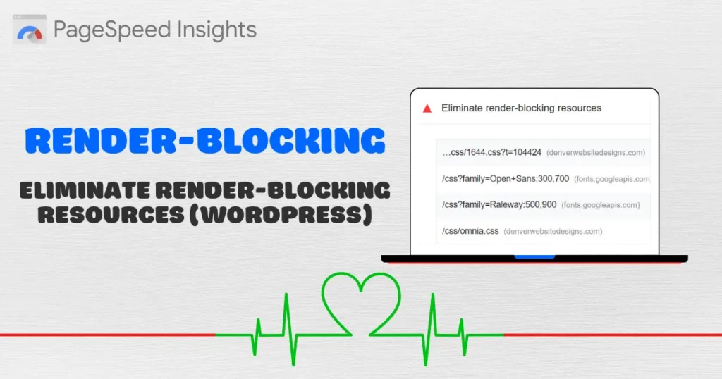